Monthly recap for october 2024
For the month of October, we focused on Dédale, our email editor. We decided to make the product more accessible, with a visual editor inspired by Figma and Notion, while preparing the transition to a pay model.
Summary of work completed during October 2024
Work related to design, product development, and communication
Product focus of the month: Dedale
Following our user research and Hermes development, we realized that a complete emailing solution would take too long to become viable. In a 100% self-funded situation, we need to be more pragmatic and quickly find our market. It's difficult, therefore, to justify spending 6 months designing and coding without guaranteed results.
So we're resuming work with more realistic ambitions.
Our ambition: make Dedale the go-to online editor for email development.
Here's a preview of Dedale's next major update:
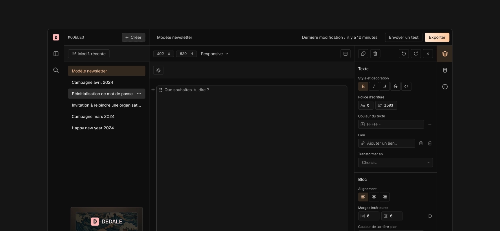
- Visual editor: Dedale will now include a complete visual editor allowing you to create templates without writing code and with an interface worthy of a design experience on Figma!
- Open API: we will open the API to allow webhook creation and provide the ability to retrieve templates stored in Dedale in Zapier, n8n, make etc. automations.
This more focused approach allows us to move faster and quickly offer useful and concrete features to consider a viable business model.
Dedale is becoming paid
Starting with the next update, Dedale is adopting a subscription-based business model:
We're keeping a limited free access:
- Full access to the visual editor
- Template creation and saving
- Real-time preview
- HTML export disabled
Paid version:
- HTML email export
- Automatic Can I Email detection
- API access
- More features to come
For our "Early adopters"
Good news for our current users: all accounts created and active before the update will retain free access to all features, for life.
More details about offers and pricing will be communicated soon. Note: This new structure will allow us to continue developing Dedale while maintaining quality service.
Dedale becomes a distinct brand from Bireme Lab
For clarity, Dedale is becoming a standalone brand while remaining in the Bireme Lab family. This distinction will allow the project to have its own identity and facilitate understanding for new users.
With this change:
- Dedicated domain
- Specialized blog on email development
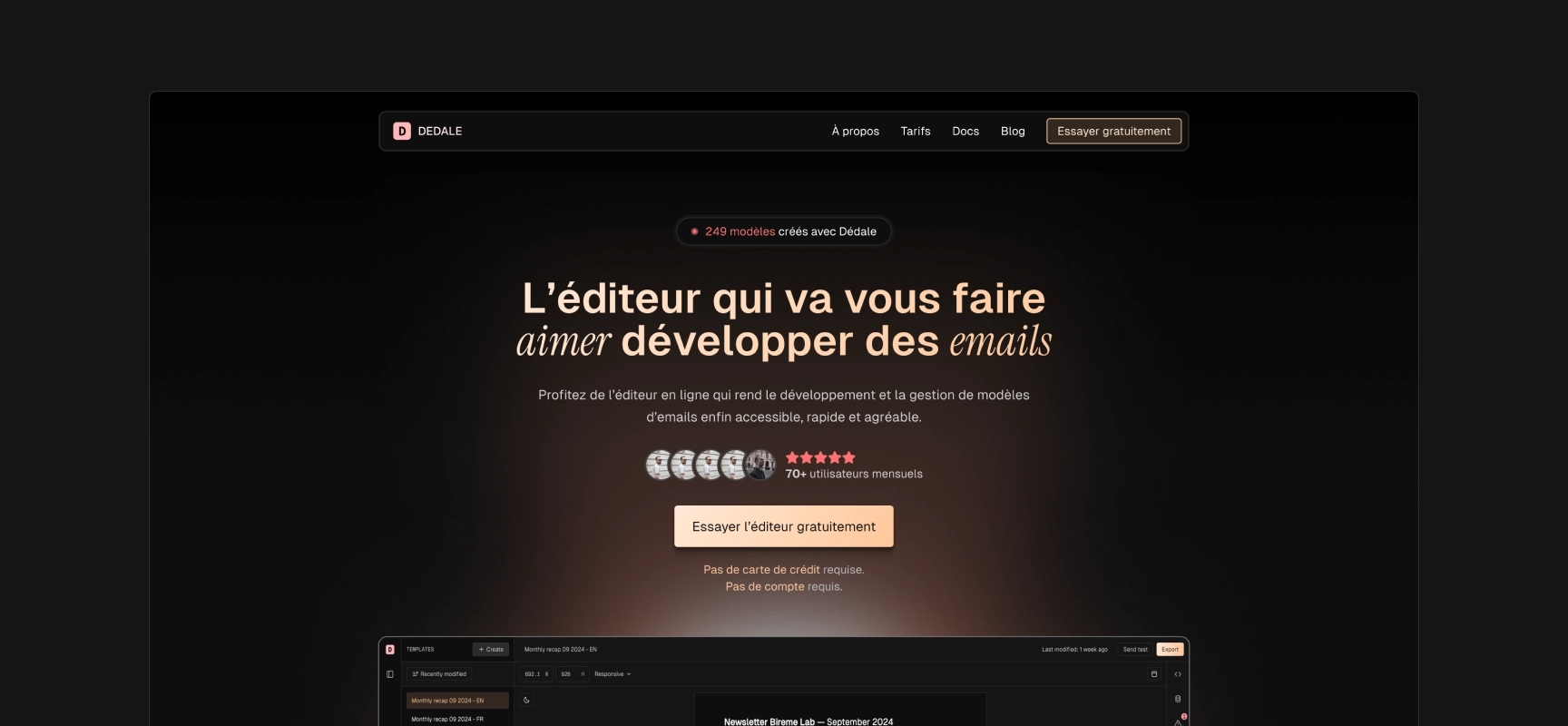
- Landing page redesign to emphasize added value rather than a simple feature list
This evolution reflects our desire to better meet concrete needs and communicate more clearly about the value Dedale brings.
Product tasks completed during the month
- Design and conception of the visual editor on Dedale

- Content and design of Dedale's new landing page version

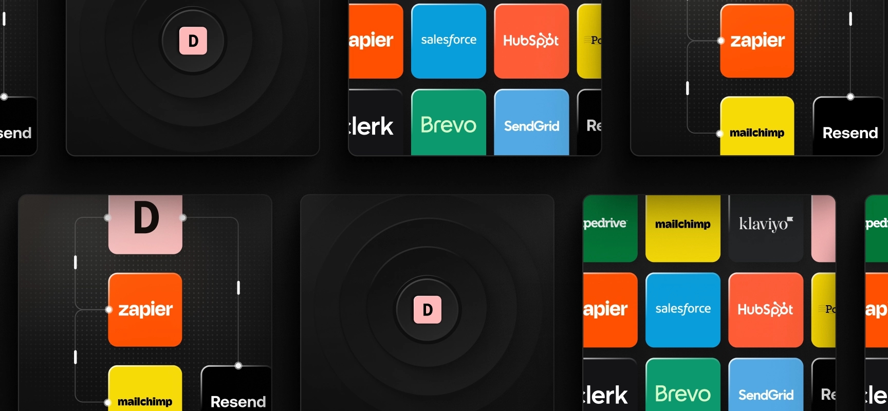
- Graphic creation of bento cards for Dedale's landing page

Focus on: the importance of UI to enhance UX
For a website, the difference between a standard mockup and a memorable one often relies on the following concepts:
- Shadow management
- Contrast and depth
- Light points
- Relief effects
- Visual hierarchy and coherence
- Images
These aspects, which are pure graphic design elements, significantly transform the impact of an interface. This is what brings a mockup to life and takes it from "correct" to "captivating". Web design isn't limited to element layout - it's also artistic work that requires particular attention to visual details.
This is what differentiates UX work that makes a project functional, and UI work that creates visual appeal.
In Dedale's visual redesign, we reworked the feature presentation graphically using the bento grid system.
For each bento card, we worked on lighting to achieve a coherent and attractive visual result.
On Figma, it's relatively simple to simulate light from shapes (circles, rectangles, etc.) by playing with the following elements:
fillcolor: use of solid colors and gradients,- layer superposition with opacity,
- use of
blend modefor layers, - use of
layer blureffect.
Thanks to the
communitytab on Figma, you can search public files with keywords of what you want to achieve to get examples to analyze and reproduce. Typelight beam effectand try to reproduce some of the creations to learn how to create light effects.
Here are our discoveries and conclusions:
Visual Hierarchy
- Light naturally guides the eye
- Lit areas attract attention
- Subtle contrasts create intuitive reading
Coherence
- Importance of a coherent main light source
- Maintaining consistent lighting direction
- Harmony between shadows of different elements
Realism
- Close objects cast sharper shadows
- Light bounces and creates secondary reflections
- Smooth transitions are more natural than harsh effects
These learnings have transformed our approach to interface design, moving from a flat style to more lively and engaging compositions.
Development Work
Tech focus of the month: Dedale
Technical tasks completed during the month
- Getting familiar with the Tiptap library which allows creating a customized text editor
- Creation of an API to fetch fonts from Google Font more quickly
- Development of specific input fields for margin editing and color selection
- Creation of the interface to modify colors and fonts of an email template
- Implementation of forms to customize different types of blocks (paragraphs, image, button)
Focus on: creating a text editor with visual and interactive elements
Dedale is evolving to reach a broader audience beyond developers. This ambition led us to completely rethink our approach to email editing. Our reflection naturally turned to tools that excel in their domain: Notion for its fluid writing experience and Figma for its creative power.
An editing experience similar to Notion: Text editing is at the heart of email creation, which is why we drew inspiration from Notion. Its clean interface and intuitive approach to content structuring have proven that it's possible to make writing pleasant and efficient, even for complex content. We want to bring this same fluidity to email creation.
Creative possibilities like Figma: But an email isn't just simple text. The visual aspect is important, and that's where Figma's influence comes in. Its way of handling visual elements and its ability to make design accessible have redefined industry standards. We want to extend this philosophy in our editor so that visual customization becomes as natural as writing.
This fusion of influences allows us to create a tool that respects both creative and writing needs.
For this editor's development, we wanted to maintain total freedom over the graphical interface, without starting from scratch with a 100% in-house solution to save time.
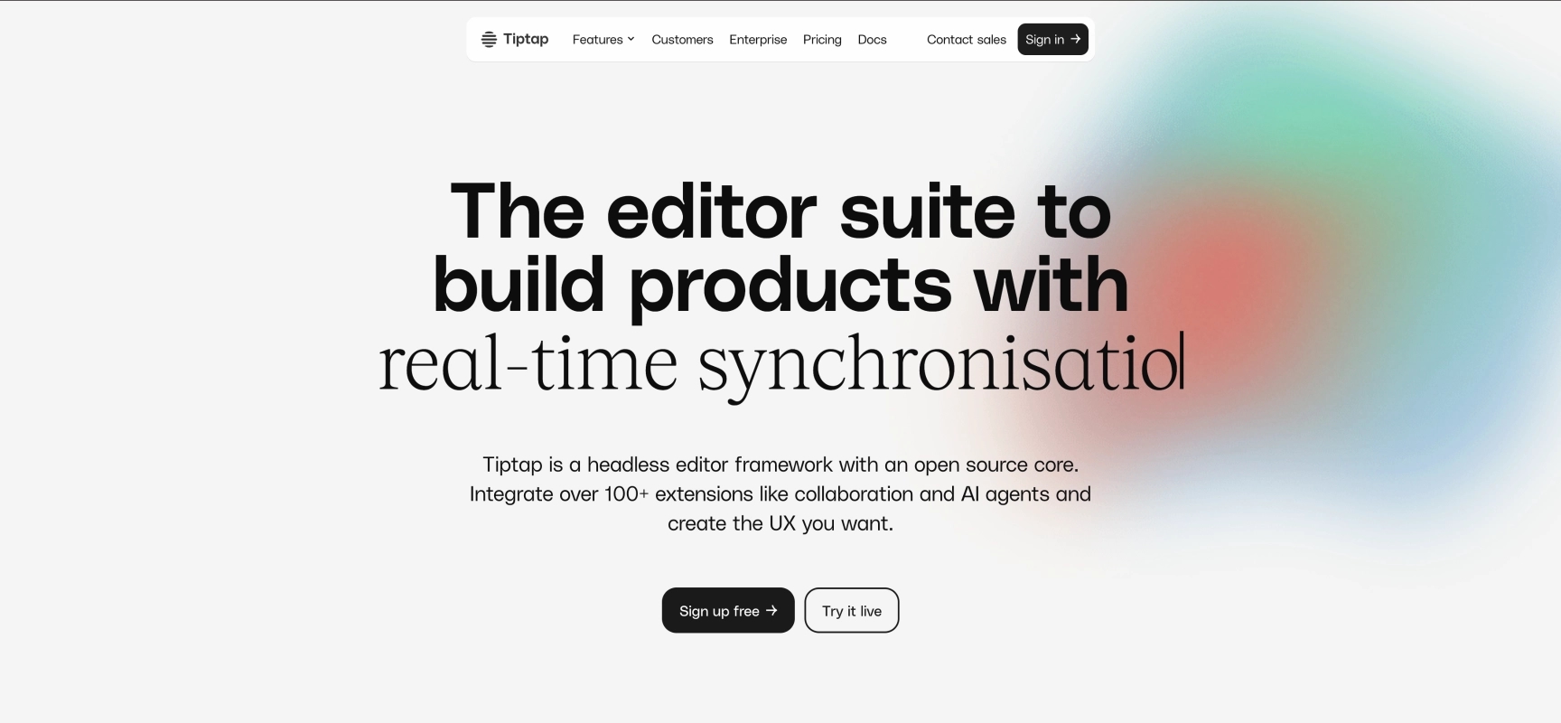
A conversation with @ledevultime led us to Tiptap, a solution that proved perfectly aligned with our needs.

Tiptap offers us the best of both worlds: a robust foundation based on ProseMirror, while maintaining total flexibility on the user interface. This technology allows us to build the experience we had in mind, without the usual constraints of traditional editors.
Its modular nature allows us to integrate the features we need while maintaining total control over the editor's appearance and behavior. It's the ideal compromise between development speed and customization freedom.
A second point we liked about Tiptap is that it works with an extension system for different types of blocks such as:
- headings
- paragraphs,
- bullet lists,
- images,
- horizontal separators, ...
We have the choice to:
- use these extensions by default without modifications,
- enhance these default extensions with additional features,
- create our own extensions.
For example, we use the Bold, Italic, and Underline extensions to offer the ability to have bold, italic, or underlined text.
For headings, paragraphs, and bullet lists, we added the ability to choose a background color, add a border, and define internal margin.
And we will create our own block to create customized buttons.